Ensure the integrity, clarity, and accessibility of services offered to citizens.
Protecteur du citoyen
Recommend and implement interface improvements on the existing website of the Protecteur du citoyen to optimize the user experience in the decision-making content sections and essential forms.

Client partnership
1 year
Most recent mandate
Close collaboration with the Protecteur du citoyen to enhance their website's user experience by optimizing key content sections and forms, while ensuring continuity and preparing for the upcoming redesign of the Whistleblowers section.
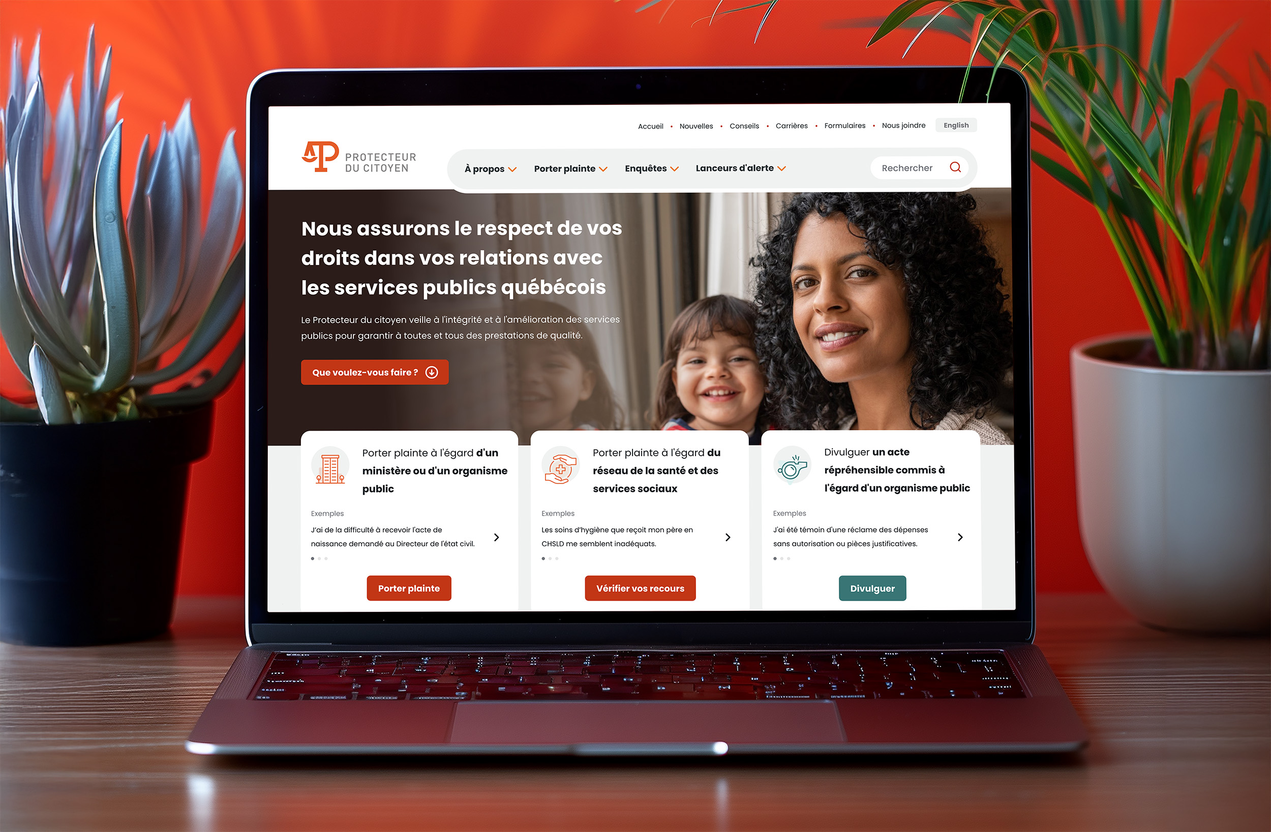
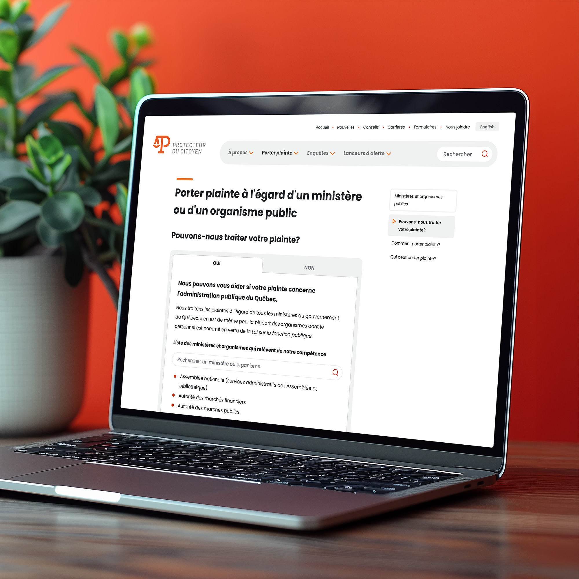
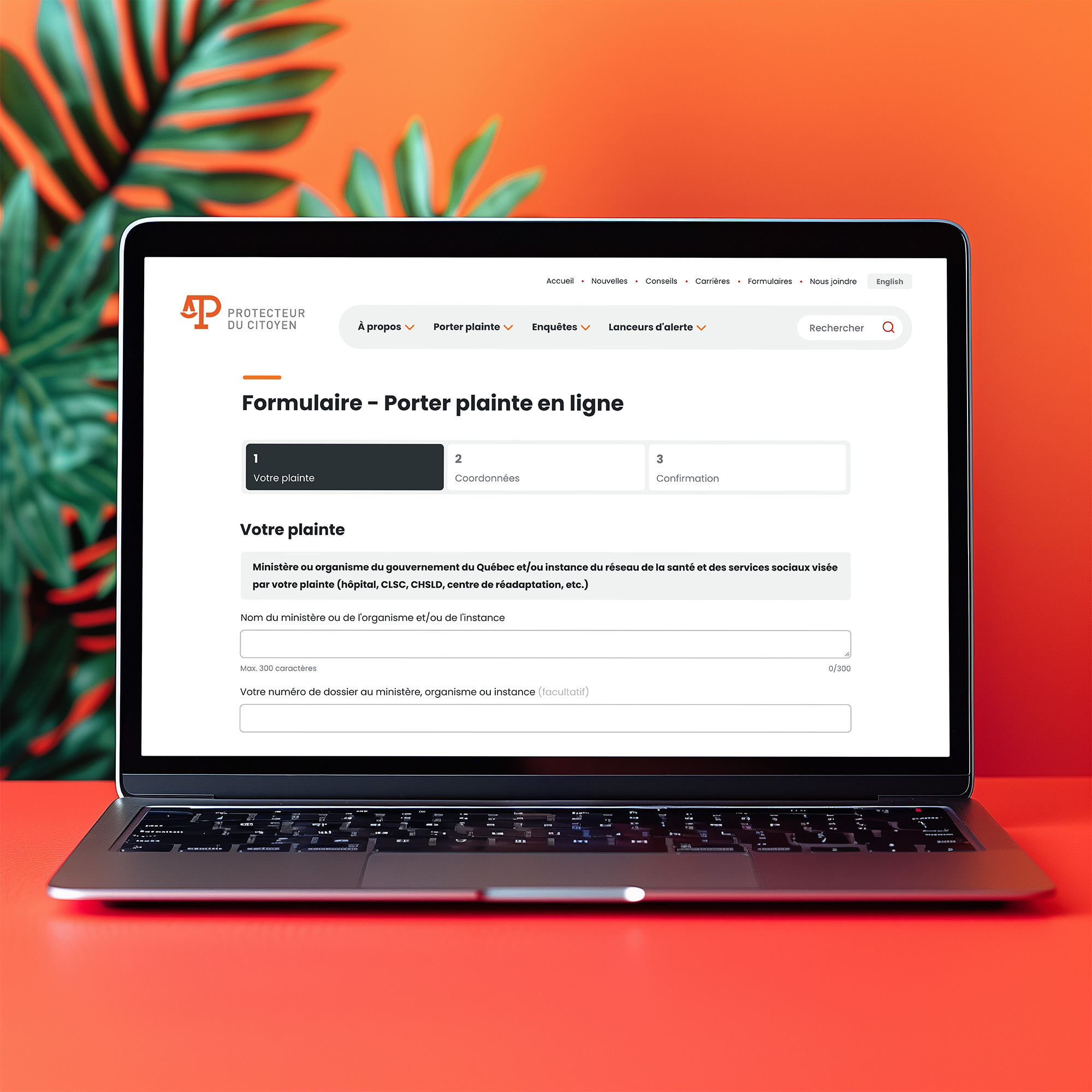
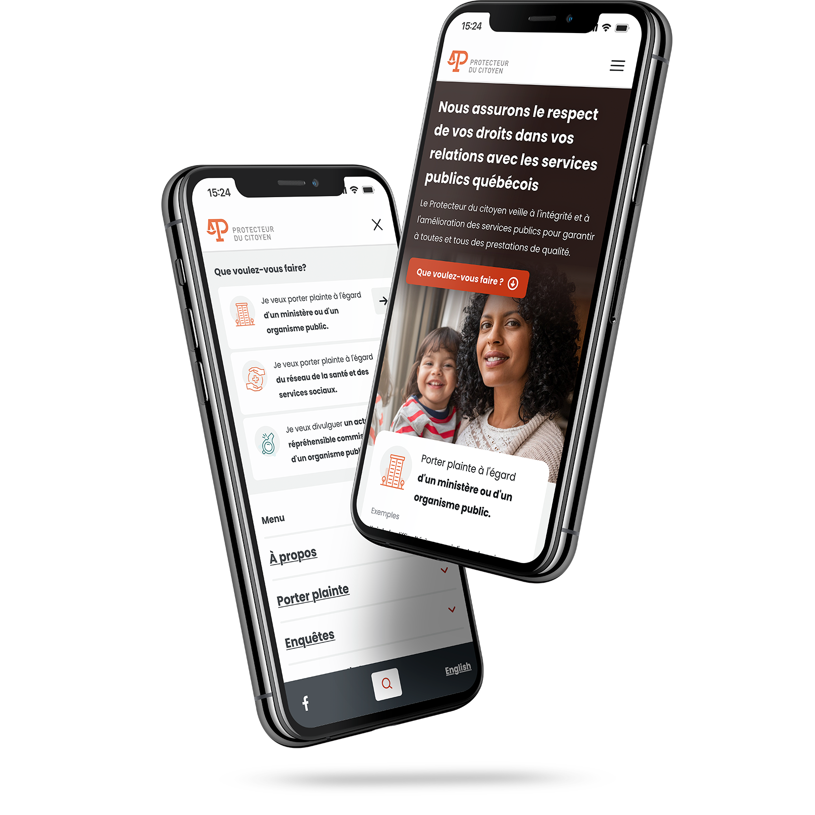
Taking over an institutional website designed by another agency, with all the technical and regulatory constraints that come with this kind of organization? Let’s be honest, it’s no easy task. But at Beet, that’s exactly the kind of challenge we love to take on. Projects where we need to balance accessibility, security, performance, design, and most importantly, human impact. When the Protecteur du citoyen of Québec awarded us the contract following a call for tenders, the mandate was clear: optimize their existing website to improve the user experience without starting from scratch. In other words, revisit the key sections and essential forms while maintaining continuity with the current platform. A fine balance to strike between rigor, innovation and sensitivity. From the outset, close collaboration with our client allowed us to clearly define needs, accessibility requirements, and the institutional framework. Several co-creation workshops helped clarify user expectations, organizational goals, and technical constraints. Every conversation brought us closer to a shared vision, always keeping one thing in mind: making things easier for citizens, especially when they're navigating complex situations. To achieve that, we focused on what truly makes a difference in the user experience: The homepage was completely redesigned to highlight essential actions right from the first few seconds (filing a complaint, understanding your rights, contacting the office). Forms were simplified and restructured more intuitively to avoid unnecessary friction. The site structure and calls-to-action were refined to guide users more naturally toward what they need. Less confusion, more clarity. That’s what guided every one of our decisions. On the design side, this wasn’t just about aesthetics, but about coherence and trust. In an institutional context, visual consistency is crucial. It reassures, legitimizes, and provides a sense of continuity from page to page. We therefore harmonized the color palette, layout grids, and components to ensure clear, fluid, and pleasant navigation. Every element has a purpose, and every detail was designed to enhance the experience without weighing it down. And because an elegant site should never compromise on security, the technical infrastructure was also reinforced. Our developers reviewed the security layer to meet the highest standards. The result is a solid, high-performing platform built to withstand vulnerabilities. But the project doesn't stop there. We’re continuing our collaboration with the Protecteur du citoyen through various targeted mandates: access to information forms, document transmission, the careers section, and the annual report page. These ongoing improvements are always aimed at simplifying the experience, ensuring accessibility, and enhancing the existing user journeys.
Visit the website


